 小垃圾
小垃圾Appearance
grid网格布局
什么是网格布局
Grid 布局即网格布局,是一个二维的布局方式,与 Flex 不同的是 Flex 是一维布局,
而 Grid 由纵横相交的两组网格线形成的框架性布局结构,能够同时处理行与列,擅长将一个页面划分为几个主要区域,
以及定义这些区域的大小、位置、层次等关系。
Grid布局是将容器划分成“行”和“列”,产生单元格,然后指定“项目所在”的单元格。适合固定不需要动态改变的布局方式。
设置display:grid/inline-grid的元素就是网格布局容器,这样就能出发浏览器渲染引擎的网格布局算法
网格布局的属性:
1.容器(container) 有容器属性
2.项目(item) 有项目属性
3.行(row)
4.列(column)
5.间距(gap) 单元格之间的距离
6.区域(area) 自己划分每个单元格占据的区域
7.内容(content)
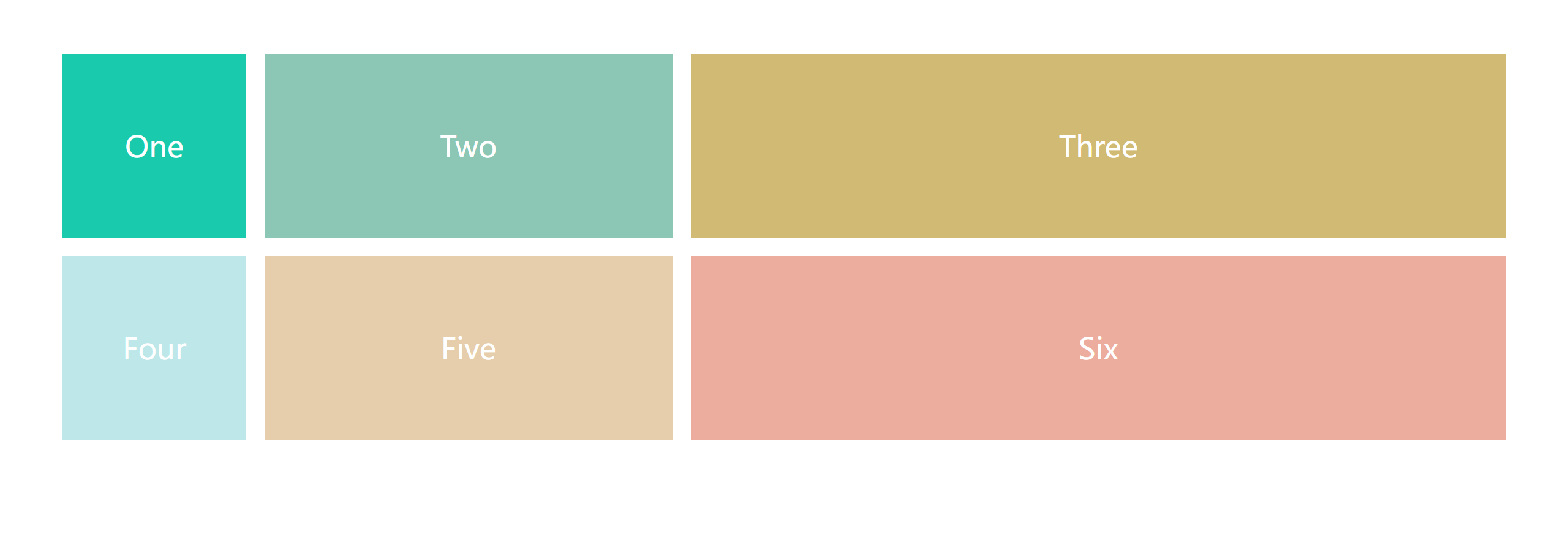
html
<div class="wrapper">
    <div class="one item">One</div>
    <div class="two item">Two</div>
    <div class="three item">Three</div>
    <div class="four item">Four</div>
    <div class="five item">Five</div>
    <div class="six item">Six</div>
</div>
css
.wrapper {
    /*
    repeat() 函数:可以简化重复的值。该函数接受两个参数,第一个参数是重复的次数,第二个参数是所要重复的值
    关键字:
    auto-fill 关键字:表示自动填充,让一行(或者一列)中尽可能的容纳更多的单元格。
    grid-template-columns: repeat(auto-fill, 200px) 表示列宽是 200 px,但列的数量是不固定的,
    只要浏览器能够容纳得下,就可以放置元素

    fr 关键字:Grid 布局还引入了一个另外的长度单位来帮助我们创建灵活的网格轨道。fr 单位代表网格容器中可用空间的一等份。
    grid-template-columns: 200px 1fr 2fr 表示第一个列宽设置为 200px,后面剩余的宽度分为两部分,宽度分别为剩余宽度的 1/3 和 2/3

    */
    margin: 60px;
    /* 声明一个容器 */
    display: grid;
    /*  声明列的宽度  3列 每列width 200px */
    /* grid-template-columns: repeat(3, 200px); */
    /* grid-template-columns: 200px 200px 200px; */
    /* grid-template-columns: repeat(auto-fill, 200px); */
    grid-template-columns: 200px 1fr 2fr;
    /*  声明行间距和列间距  */
    grid-gap: 20px;
    /*  声明行的高度height 参数:第一行高度 第二行高度 */
    grid-template-rows: repeat(2,200px);
    /* grid-template-rows: 200px 200px; */
}

.one {
    background: #19CAAD;
}

.two {
    background: #8CC7B5;
}

.three {
    background: #D1BA74;
}

.four {
    background: #BEE7E9;
}

.five {
    background: #E6CEAC;
}

.six {
    background: #ECAD9E;
}

.item {
    text-align: center;
    font-size: 200%;
    line-height: 200px;
    color: #fff;
}
效果